Hi first of all thank you for the packages you are making. I have a question. With the roof graphics I can't complete it correctly. As you can see it inserts the roof edges everywhere. Maybe a roof resource is missing or is there a way to fix it?
For the base rectangle rooftops, there's a set on tileA3. For regular houses like the one in your image, it's easy to use the autotile.
The other tiles that you have are used for extending that roof into different shapes. Holding the shift button while placing those tiles will prevent them from warping the autotiles around them.
I've released some 4-dir action animations for Time Fantasy on patreon, but the set is too big to support that for the overall series. For now Elements will support four-directional combat and Time Fantasy will remain primarily intended for side-view RPGs.
Yeah, I saw that. I already own all of the Time Fantasy assets, though. I'll keep my eyes open to see if the Time Elements gets its own dedicated bundle.
Also, FANTASTIC work on these, Jason. People here don't give you enough credit.
That's from the RPGMaker autotiling. You need to hold the Shift button to override the automatic tiles. Sorry I didn't see this earlier, I hope you got it!
If you're using RPG Maker-- the lights were designed so that you can align them by putting the event on the tile underneath. That way you can have another event for the light source, because they can't normally have two tiles on the same space.
← Return to asset pack
Comments
Log in with itch.io to leave a comment.
Hi
For the base rectangle rooftops, there's a set on tileA3. For regular houses like the one in your image, it's easy to use the autotile.
The other tiles that you have are used for extending that roof into different shapes. Holding the shift button while placing those tiles will prevent them from warping the autotiles around them.
Hope that helps.
thanks!
Do you intend to create graphics with attack for ABS in the Elements style, but in Time Fantasy?
I've released some 4-dir action animations for Time Fantasy on patreon, but the set is too big to support that for the overall series. For now Elements will support four-directional combat and Time Fantasy will remain primarily intended for side-view RPGs.
Loving the elements set, any plans for an overworld tileset?
Eventually! 🤣 There's a lot on the to-do list. Thanks!
Hi there, I am interested in buying multiple packs, do you offer any bundle discounts?
Theirs a bundle up for the Elements set https://itch.io/s/129459/time-elements-bundle
This bundle ended in September. Will there be another one in the future?
Right now these are a part of the winter sale bundle. After the sales are over there will be another regular bundle. Thanks!
Yeah, I saw that. I already own all of the Time Fantasy assets, though. I'll keep my eyes open to see if the Time Elements gets its own dedicated bundle.
Also, FANTASTIC work on these, Jason. People here don't give you enough credit.
Holiday bundle ends tonight, so I'll set up the regular one now.
https://itch.io/s/129459/time-elements-bundle
Also-- Thanks, I appreciate it! That means a lot.
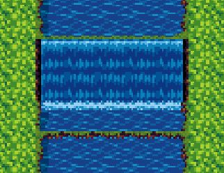
Is it possible to build a waterfall without being stuck with these unwanted green lines across the water? Thanks.
That's from the RPGMaker autotiling. You need to hold the Shift button to override the automatic tiles.
Sorry I didn't see this earlier, I hope you got it!
winter and fall versions?
Does this work with Time Fantasy in terms of the relative size of objects? Or at least not clash badly with it?
Yes, the sizes are very similar. The biggest difference is the more vibrant color palette and the more detailed texture style.
when do u normally put out new things? as in when can i expect things to be added as in the new stuff ur adding to time fanasty?
There's new stuff every week on my patreon. For bigger releases and expansions there is no regular schedule. Thanks!
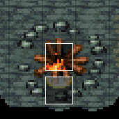
The "lights" character animation does not align with the metal post light
tile. Either way too high or way too low.
If you're using RPG Maker-- the lights were designed so that you can align them by putting the event on the tile underneath. That way you can have another event for the light source, because they can't normally have two tiles on the same space.

Like this:
Hope that helps, thanks!
I found the right glow variant.
Just noticed the different heights to choose from on the light animations
Thank you for the quick response
I really like this new style and hope you'll be releasing more like it!